参考:
在使用matplotlib包绘制图表时,通常需要手动设置颜色,官方虽然提供了一系列的 colormap,但并没有明确指出离散绘制的线条类图形怎样进行颜色的引用。
经过查阅网上的资料,获得了以下解决方法:
1
2
3
4
5
6
7
8
9
10
11
12
13
14
15
16
17
| import numpy as np
import matplotlib.pyplot as plt
x = np.linspace(0, 2 * np.pi, 64)
y = np.cos(x)
fig = plt.figure()
ax = fig.add_axes([0.1, 0.1, 0.8, 0.8])
num_lines = 5
colors = plt.get_cmap('jet')(np.linspace(0, 1, num_lines))
for i in range(num_lines):
plt.plot(x, i * y, color=colors[i])
plt.show()
|
或者使用参数循环的形式:
1
2
3
4
5
6
7
8
9
10
11
12
13
14
15
16
17
18
19
| import numpy as np
import matplotlib.pyplot as plt
x = np.linspace(0, 2 * np.pi, 64)
y = np.cos(x)
fig = plt.figure()
ax = fig.add_axes([0.1, 0.1, 0.8, 0.8])
num_lines = 5
ax.set_prop_cycle('color',
[plt.get_cmap('jet')(i)
for i in np.linspace(0, 1, num_lines)])
for i in range(num_lines):
plt.plot(x, i * y)
plt.show()
|
输出结果如图所示:
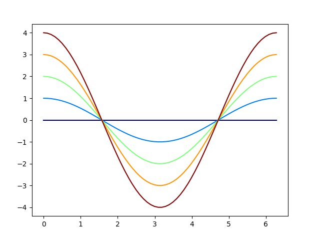 Colormap 绘图结果